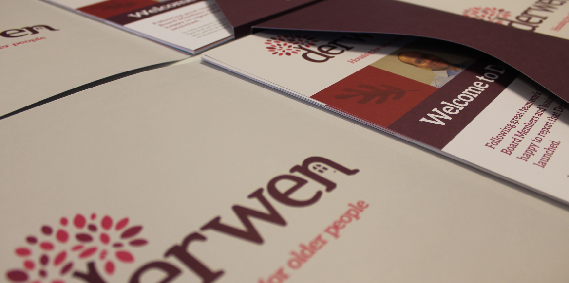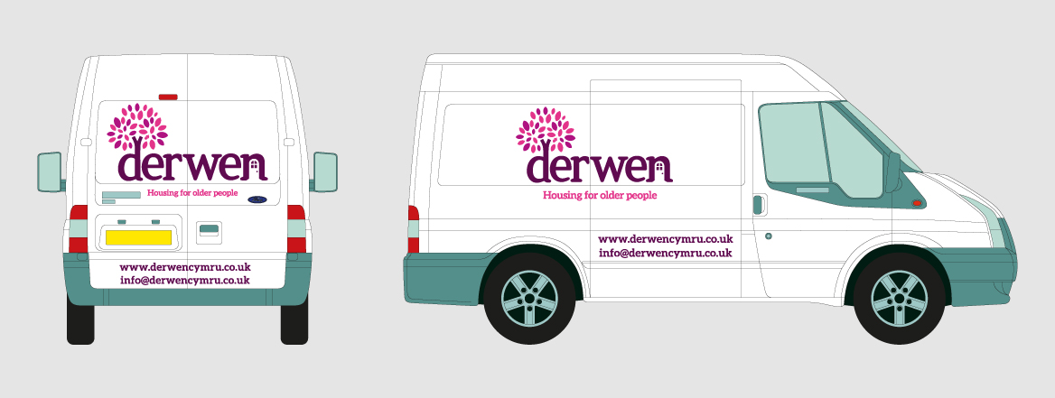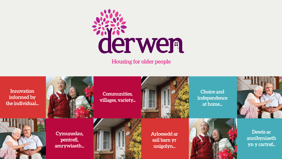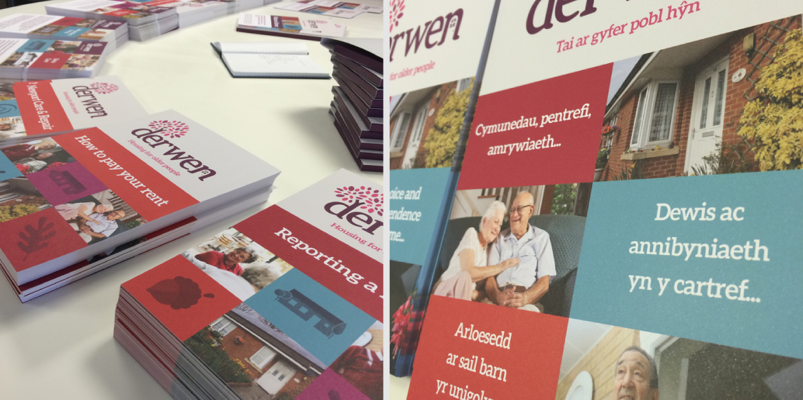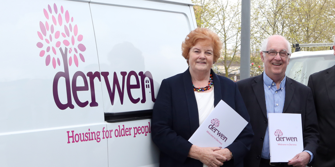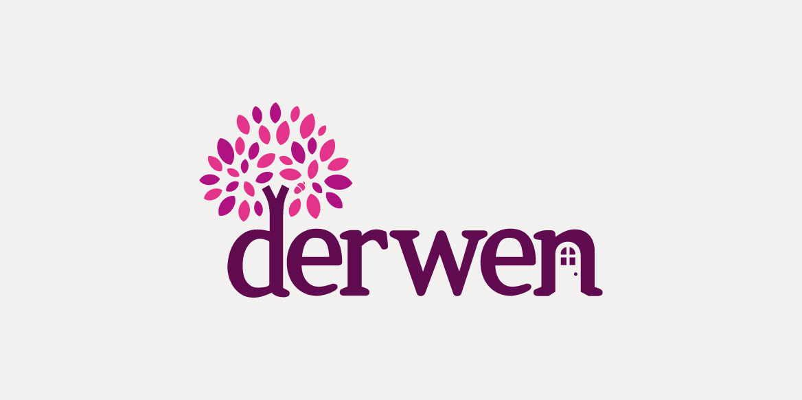
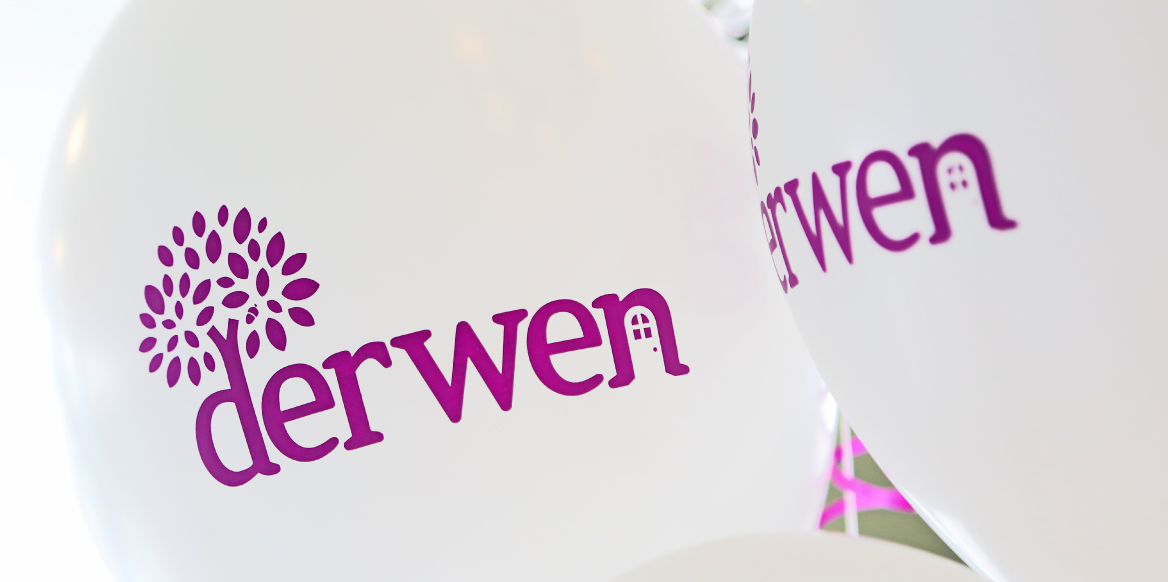
Derwen is a South Wales-based housing company that provides homes and support for people over 55. The brand needed to feel welcoming, safe, and reflect the company’s strong values. Inspired by the meaning of ‘Derwen’ — Welsh for ‘oak tree’ — the brand was designed to symbolise strength, stability, and home.
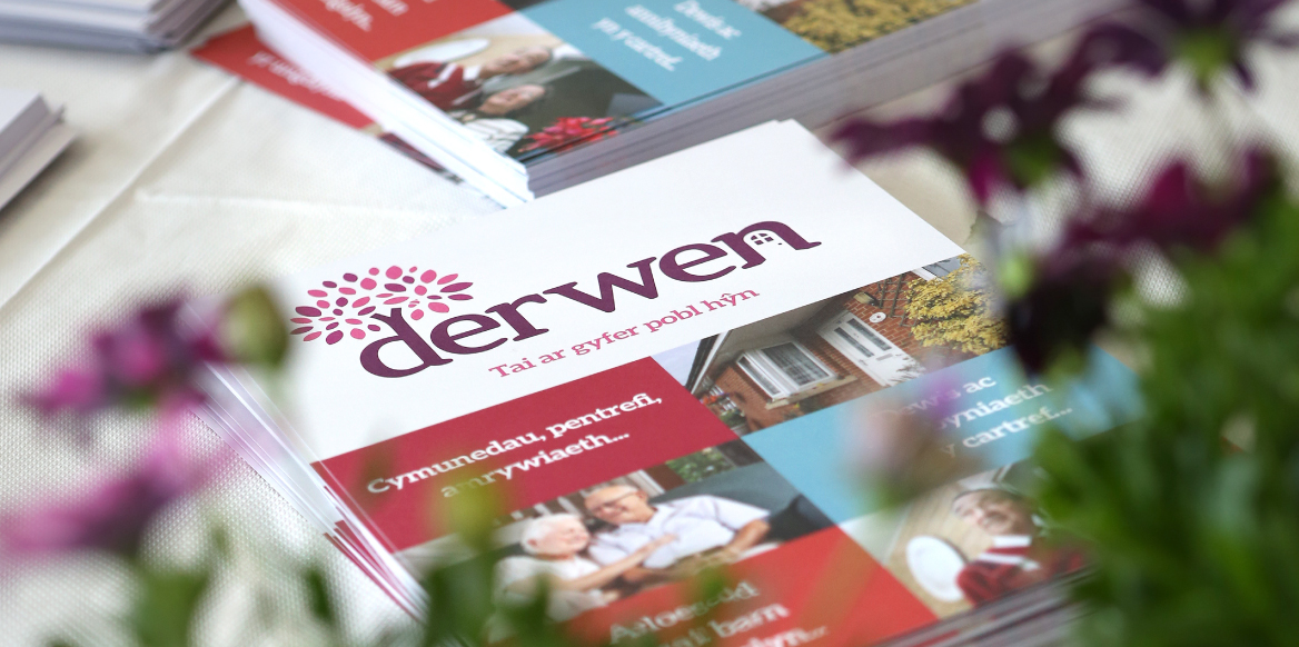
The goal was to design a brand that felt calm, secure, and inviting while still standing out in a competitive market. The oak tree symbol provided a natural starting point, representing growth, support, and community.

The website was designed to feel simple and intuitive, ensuring users could find information quickly and easily. The design reflected the warmth and security of the brand, with clear navigation, helpful content, and a focus on accessibility for older users.
By blending thoughtful design with a clear strategy, the Derwen brand now reflects its values of community, safety, and support — giving tenants and clients confidence in their housing provider.